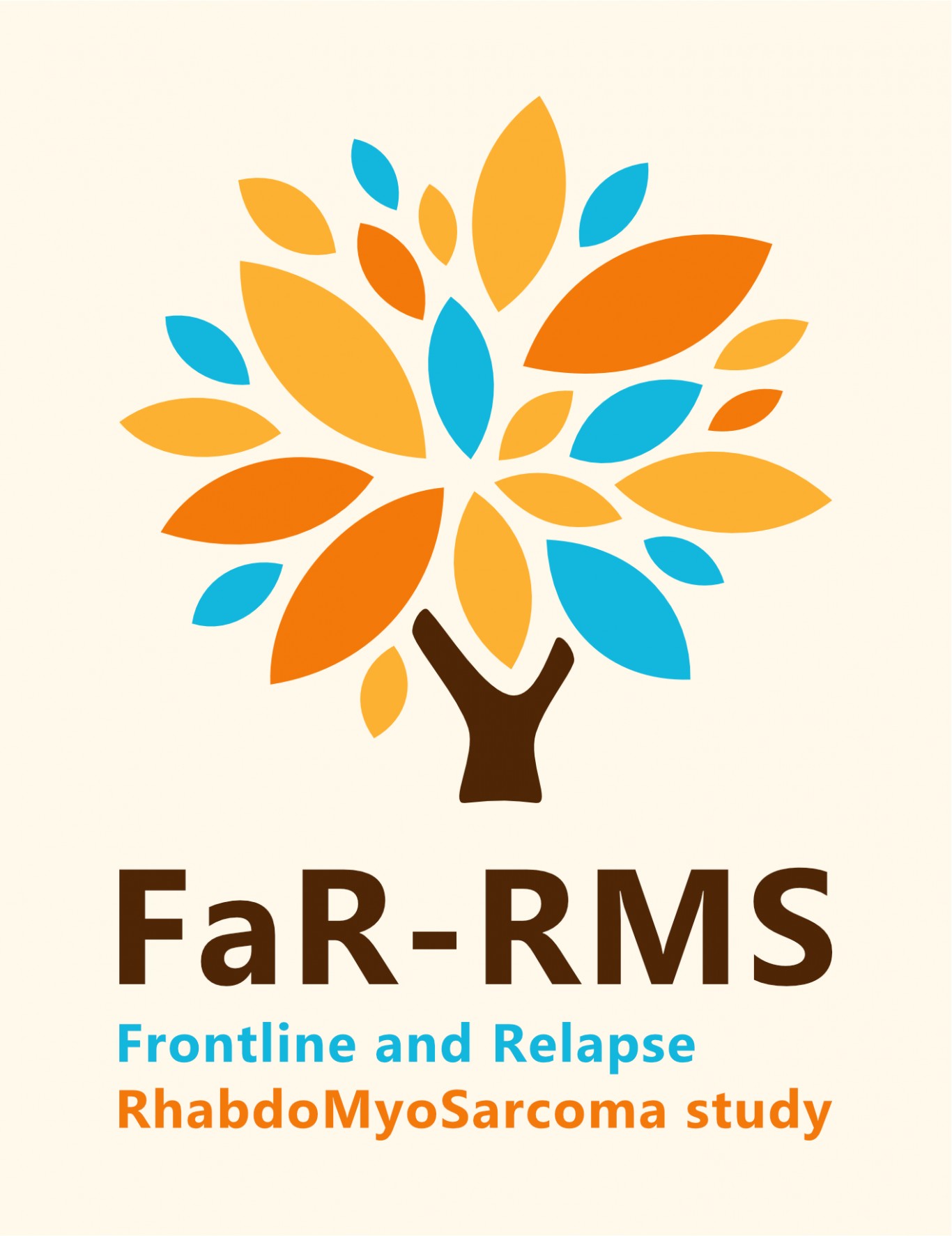
The logo was designed by a young cancer survivor after input from parents, patients, clinicians and scientists.
We are delighted to announce the new logo that will represent the FaR-RMS (Frontline and Relapse Rhabdomyosarcoma Study) trial, which launched in September 2020. This was created through the engagement of members of the Royal Marsden NHS Foundation Trust, Youth Forum and several rhabdomyosarcoma survivors in conjunction with Alice’s Arc, a children’s cancer charity focused on rhabdomyosarcoma.
We spent several sessions discussing brand development and brainstormed ideas about themes we thought the logo should encapsulate to portray rhabdomyosarcoma, the cancer journey, the use of straplines, the use of graphics, how the typeface should look and so on. We then devised a design brief which was used as a basis for the designers involved. One of the young cancer survivors is an aspiring graphic designer and he worked with the graphic design team at international law firm, Allen & Overy to create concepts.
Three logos were short listed and various stakeholders were consulted for feedback. These included parents, patients (children and young people), clinicians and scientists. In the end, opinion was split between two options. The final decision-making factor came down to the fact that the chosen logo was designed by the young cancer survivor.
The tree logo represents hope, growth and life. The leaves resemble a central attack or blasting of cells within a tumour converging at a single point. The tree stump represents a wishbone conveying the concept of good luck for a patient embarking on the trial. The blue colour represents the medical community, the yellow/gold expresses the hope and optimism a clinical trial can bring, and the orange is meant to be playful for the younger audience. The FaR-RMS acronym has been annotated to make it clear what the trial is about.
We look forward to watching this being rolled out as part of the FaR-RMS trial.
